29. Page and Site design
Introduction (click any heading to come here)
So far on the design topic, you have learned the definition of design and studied designer's goals. Next you learned about the business of design; how to get your message across. Now that you have a foundation in design, it is time to get you closer to authoring pages and assembling a site.
Page design objectives
This section describes your page design objectives in priority order. Before you begin on page design double check that you have well organized content. If needed, revise the content before starting page design; postpone working on the appearance of your pages until the content is organized. Here is the list of your objectives as a page designer.
- Organize and refine page content
- Structure pages that support a clearly organized site
- Work on appearance after finalizing and structuring content
Checkpoint (answer then click)
You have just learned the objectives for your work as a Web page designer. Take a moment and write them down. Remember the priority order of the objectives. Click the checkpoint when you have finished.
Web language
You will be introduced to Web language first. Many Web authors write their own content and this introduction is necessary for them. Other authors act as Web software engineers and are not responsible for writing, and they may find it interesting to learn how Web and printed language are different.
Well written content is the reason users stay at your site. Writing is a reflection on you and your company. You cannot learn how to write by studying these pages, but you will see how very important writing is on the Web and learn some techniques.
Web writing is vigorous
Users scan your words. They do not read them word for word. Let users find the information they want quickly. Write clearly and be brief.
Omit needless wordsVigorous writing is concise. A sentence should contain no unnecessary words, a paragraph no unnecessary sentences, for the same reason that a drawing should have no unnecessary lines and a machine no unnecessary parts. |
White's 17th rule: William Strunk, Jr. and E.B. White,
The Elements of Style (Allyn and Bacon, 1979).
Speak the user's language
You have studied the definition of Web design, and understand by now that that your audience must be well-defined. Speak their language, not the programmer's language (unless that is the audience). Avoid technical jargon. When in doubt simplify the language and be direct.
Guidelines for writing
- · Use an active voice, second person
- · Get organized, write clearly, be brief
- · Use half the words you would on paper
- · Saying too much dilutes information
- · Closely follow the rules of writing
- · Write, rewrite, spellcheck
Let readers find information
- · Use headings as summaries
- · Use meaningful subheadings
- · Use lists
- · Use link menus
- · Use callouts
Web writing experts
John Mokes and Jakob Nielsen
- · Write in an inverted pyramid, conclusions first
- · Screen reading is tiring
- · Screen reading is about 25% slower
- · 79% of Web users don't read, they scan
- · Users adopt an "information foraging" style
Points of view
Your (mistaken) point of view
- · You write great literature
- · You presume rational users
- · ...and attentive users
The user's (actual) point of view
- · Billboards at 65 mph
- · Information sharks... keep moving
- · Its not important to figure out the right way
- · Weighing options may not pay off
- · Guessing is fun
Usability criteria
- · Nothing important is more than 2-clicks away
- · Speak the user's language
- · Be consistent
Layout for screen/printer
Part of the definition of Web design concerns your audience. Know their equipment, particularly their screen size. In general, the majority of Web users having screen resolution of at least 800 x 600 pixels (W3 Schools)
Layout for mobiles
See this great page called 8 Crucial Design Tips For Mobile Websites and spend time getting acquainted with Bootstrap. This package includes CSS and Javascript kits free and ready for you to use.
Screen width
If you elect the 800 pixel width, be aware that your usable width is less, usually about 750 pixels. This is because of window frames and scroll bars. Your canvas is then 750 pixels.
Screen width issues
Requiring horizontal scrolling is a serious usability flaw. Here is a list factors that you must become aware of to prevent horizontal scrolling.
- Width of combined graphics and text per line*
- Width of preformatted text <pre>
as this page is constructed.
Printing issues
Visitors may routinely print your pages, depending on your content. Newsletters, recipes, phone lists, and essays are examples of likely printed content.
You should be aware of page width constraints that will cause printing issues. The Web Style Guide reports that the maximum width for printing is 560 pixels. If you expect a page to be printed, it is best to limit the combined width of graphics, margins and text to 560 pixels.
Think of a printout of your page as a calling card. It is a lasting reflection of the page, and cannot be changed after it is printed. It should read well and look good.
Fonts and typography
Book publishers refer to "typeface" and Web developers refer to "fonts" to mean the same thing. Typography is the general name of this topic.
Screen reading of sans serif fonts (this is an example) is less tiring than serif fonts (this is an example). Conversely, reading material printed with serif fonts is less tiring than sans serif fonts. Using styles to switch font families between screen and print can be handy for this reason.
You want pages to read well and look good in both mediums.
The psychology of reading
You are a skilled reader capable of reading this passage quickly. How does your eye acquire the information? Experienced readers process the words and even phrases in chunks. Readers look for the shapes of words as clues to the chunks. Because the shape of words is important to reading on the Web, it is included in the design lesson.
Font family and case influence readability because they control the shapes of words. Examples follow next.
Font family and case
Here are some rules and examples to help you choose upper or lower case and initial caps. These rules apply to headings as well as paragraphs.
- If possible with your design, let users choose their font (a browser option)
- Style paragraphs in all lowercase; use initial caps only for proper nouns
- Avoid initial caps, they make words bumpy
- Avoid all caps
Avoid Initial Caps, They Make Words Bumpy
Avoid all caps, they reshape and make words unfamiliar
AVOID ALL CAPS, THEY RESHAPE AND MAKE WORDS
Page and site issues
Writing essays or manuals?
Highly organized content in a highly organized site is the goal of design. But authors who write the content may not consider how it will work on the Web. They may write essay-like content in Word as if it is be printed and stapled. We are trained in school to write this way.
Certain paper documents (i.e., policy manuals) are intended to be distributed in a loose-leaf notebook because they can be updated by replacing pages. The material is chunked into single pages that deal with single policy issues to facilitate updating. This organization is closer to what we do on the Web than the stapled essays.
Writing small or large pages?
Loose-leaf content lends itself to small pages. Essay-like content would usually result in large Web pages. Neither is inappropriate for the Web, as long as the pages and the site are clearly organized.
Next, we will look at when it is most appropriate to create small or large Web pages.
Small page size
Small pages have two or fewer full screens of information. You usually will not have short pages unless there is an outline that organizes the material and breaking up an essay-like document can sometimes reveal an outline. Outlines also suggest headings. Headings are crucial in Web writing, and are the basis of your menus for navigating among your pages. You want short pages as:
- · Homepage or splash page
- · Pages with large graphics
- · Frequently updated pages
Large page size
Large pages cause users to click the horizontal scroll bar or press PgDn. Frequently asked questions and reference pages are often on large pages with questions and hyperlinks at the top, and answers at the bottom. These long pages work well because there may be several pertinent questions users need to read. You want long pages for:
- · Looking up information
- · Providing structure like paper
- · Downloading and printing
The smallest site
One-page sites are very common. You might place your resume on the Web and let prospective employers know your site address.
As long as the resume is well written, organized, looks good on the screen, and looks good when printed then you have no concerns about site design.
Introduction to site design
Good site design is the result of highly organized and well written content, page layout and navigation design.
Many different site structures work well for organized content, but no structure can correct poorly organized content.
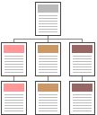
The site shown at the left is organized hierarchically. Other site organizations are sequential-linear, grid, frame based and Web or wheel. Many successful large sites depend on more than one structure for navigating among pages.
One proof of good site design is how quickly visitors find what they are seeking.
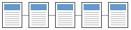
Linear-sequential site
This site design supports linking to pages in a specific order. You cannot link to page 3 unless you are viewing page 2. The purpose of such a design is to keep the content is a specific order and not let visitors skip ahead without at least a cursory look at intermediate material.
Linear-sequential site examples
Learning material for textbooks and courses offered online is sometimes organized in this way. For example, chapter 5 above would be written for readers who have read the previous chapters.
An inappropriate site design could produce a legal liability. If linking around critical legal information (consumer safety or consumer responsibility) is supported by the design, an injured party could claim the information was omitted from the usual sales sequence at the site. In the case of a linear-sequential site design, ignoring important legal information would be the responsibility of the visitor, not a liability of the site designer.
Grid site design
The grid is a variation of the linear site. And it appears below as layers of that design. Visitors may move about the site in two dimensions instead of one, but only in a step-by-step sequence. This may seem rigid but it has a place in our survey of designs nevertheless.
The two dimensions are represented as color and shape in the example graphic. Visitors may link across the colors or across the shapes, but not across different shapes of different color.
Grid site examples
Highly organized content is necessary for such a design to be useful. Examples are technical reference material, repair manuals, critical procedures organized in a if-then sequence, and organized learning material that can be tiered into a novice-to-expert sequence.
Both the linear-sequential and grid site designs seem to be unWeb-like to students because of their fussy control of linking. But controlling linking helps prevent visitors from overlooking important content.
Frame based sites
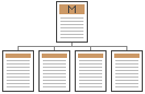
Frame based sites have their content in pages that are separate from the menu page(s). Look at the site diagram above. Content is in the lower row of pages and the navigational menu is in the top page. When you studied HTML frames you learned how to construct frame based sites that consisted of multiple pages.
Frame based pages

Visitors to a frame-based site will see the menu and content pages combined into a single Web page. Frame designs should include a left- or top-menu and content at the right or below the menu. This is familiar to visitors and easy for you to structure and maintain.
Disadvantages of frames
There are some disadvantages to using frames. Users cannot save specific pages as favorites. Your starting page (the frameset URL and its title) will be saved instead of a specific page they may want to return to.
Because the left menu will be included in the printout, the total width for printing (560 pixels maximum) will include the menu width and the content width combined.
Non-framed sites
Wheel site design
Because the design objective of wheels is to link from any page to any other page, this design also goes by the name "web." Visitors are not hampered by the step-by-step sequences of the previous site designs. They may go to any page that is of interest.
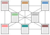
The previous step-wise sequences we saw connoted site structure, a desirable attribute that wheel designs may lack. Organizing a wheel site can be difficult work, but necessary because organization and structure are so important to your visitors.
Navigating wheel sites
Linear sites can use Next and Previous links to take visitors around the site. Wheels would have more than two links, in fact they have (N2 - N) / 2 links.
Four page sites need 6 links per page, five page sites need 10 links per page, and so on. A ten page site would have 45 links per page!
Common navigation is best
Use familiar navigation links when possible: Next, Previous, Homepage, Top of page. We feel at home visiting sites that provide these common navigational aides. Navigation that is novel tends to confuse us. Do not be inventive with something as fundamental as linking among the pages at your site.
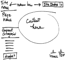
You can provide graphic buttons in the shape of arrows or simple text to communicate the links. Here is an example of a text footer that could appear on every page at your site.
Navigation for wheel sites
The all-text footer will not work well if there are 90 pages you have to link together. The best method in this case is to add a familiar pull-down list to the text footer. Remember you will need Homepage, Top and Contact us in wheel sites as well.
Hierarchical, drill-down or bread crumbs
These menus are common on Amazon, Sears and other shopping sites. They are expected on sites with heavily organized content. Clicking on an element takes the visitor to the beginning page of the element at the site.
Visual components of your site
Starting your design
Begin on paper, a napkin, the back of an envelope, or anything at hand. If possible, use a chalk or white board with your team helping you layout a prototype page.
If you elect the team work route to design, make a rule that the first round or two of suggestions during meetings will not "evaluate" but rather "generate" ideas. After many good ideas are gathered on the board, begin to pare them down for the first-draft page layout designs. This strategy may help reduce tension and bad feelings. And having ideas denigrated in meetings stifles creativity.
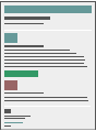
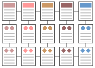
Page components
Here is a sample of attractive layout using simple graphic headings with underline accents you can easily make yourself. The text has a faint shadow, the underline is a light colored line which ends in a thicker line of the same color.
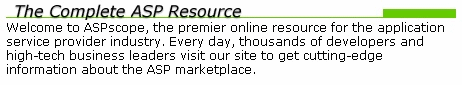


Because the width of the top component is only 460 pixels, you have room to add menus on the left and/or feature information/pictures on the right. Remember to carry the same color and graphic themes on all pages at the site. Change colors to indicate another section of the site.
Use this layout only after you have organized your content.
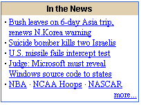
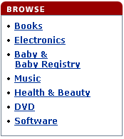
Link lists with borders
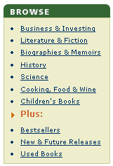
You cannot find a popular shopping site that does not use these page elements to great advantage. They contribute to the design by organizing the page, attracting attention, and supporting the design/color theme. Wouldn't it be nicer if the three items just mentioned were in an attractive box with borders?
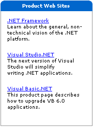
Photographs in design
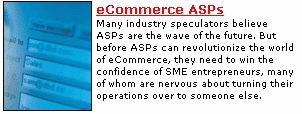
 Photos of people provide recognition of the content. Although you may not see photos of Tim often, the next time you do you might understand the context better. Use photos sparingly. Like all good design elements, overuse dilutes or changes your design. Have you heard the phrase "less is more?" Similar to using colors to accent page elements, photos should accent content. Photographs are factual and have a strong cognitive (information) component in design.
Abstract images in design
Abstract photos can be used to great advantage since they provide more of an affective than cognitive component. They set the mood of an element and the site. Similarly, colors connote feelings with blue being calm, red being action-oriented, gray being reliable and stable, and so on.